How I Make Easy To Use UI Asset Packs (And How You Can Edit Them to Fit Your Game)
Hello everyone!
I wanted to make this post to give people who are new to game dev and may have just found my asset packs some more information about how they are made and how to edit them to fit their projects.
Even if you have been making games for a while and UI just downloading the packs themselves and looking at how the PSDs are made can be a great learning experience if you are new to designing UI!
To begin with, I think it is important to explain the actual process that I have when I make the free asset packs that I release on here on Itch.io. They need to tick 3 boxes before I will consider them ready for public use:
- Be as easy as possible to edit
- Able to fit a wide range of games
- Look polished
Accessible and Easy to Edit
All my asset packs come with exports of all assets as well as the full PSD files for users to open and edit to their heart’s desire. The entirety of the assets are made with bare bones Photoshop techniques so that anyone can change them.
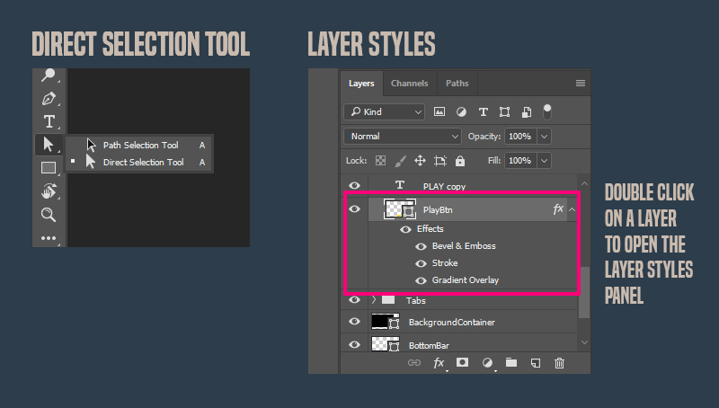
- Every asset is made from a shape. Using the direct selection arrow tool you can easily drag the corners and change them.
- Some assets have basic layer styles added such as a drop shadow, stroke or a colour/gradient overlay. These can be edited by double-clicking on the layer in the layer panel.
- All fonts used are free to use and a link to download them is included on the Itch.io page.
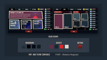
- I try to make colour choices for the pack that users can then use as a base to swap in their own colour palette.
Something for Everyone
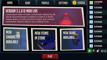
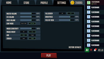
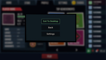
Designing a pack that could fit a lot of games isn’t just about the colour palette or the style, it is also about the features in it. What I mean by this is it must include things like buttons, health bars, dialogue boxes and basic menus like settings and quitting. Without enough base features included in the pack, it won’t be usable by many people.
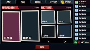
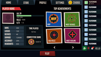
I wanted to go a step further and include some basicFPS and Battle Royale/Multiplayer features in this pack. I did this because I noticed that a lot of new devs gravitate towards FPS games in the early stages - Unreal 4 even has it as a preset. Battle Royale games are very popular at the moment and I’ve had an uptick in people reaching out to me looking to start developing these types of games with no prior experience. Obviously, Battle Royale games are a huge undertaking but at least with this asset pack devs can get the base UX for a store page and player profile to start with.
Polished Assets Don’t Need Bells and Whistles
Look, I get it, you want the flashy, hand-illustrated UI of your favourite AAA game. Your first game probably isn’t going to look like that, and that’s ok! The good news is that you can make a nice flat style UI that works and feels good for the player to use.
In terms of UI polish comes down to one thing:
CONSISTENCY
If you use green for your buttons use the same green everywhere. Make sure you use the same size buttons unless they need to stand out. Pick a colour scheme and stick to it. If you’re not good with colour yet then use a tool like http://colourschemedesigner.com/csd-3.5/
If you are using layer styles on shapes - right-click the layer to choose “Copy Layer Styles” from the pop up menu so you can paste it when you need to. Every asset should have the same light source and therefore the same drop shadow.
Keep consistency across all screens, not just one. I make a copy of the screen I’ve just finished and save it to use as a base for the next one so I have all the same assets ready to rearrange into a new UX.
Of course, all rules can be broken once you have some experience! For those of you just starting however, I can not place enough importance on consistency. I often get hired to redo UI on projects where the concept for the UI is good but the execution is just too inconsistent. Inconsistency in UI makes it hard for the player to find it intuitive. They should be able to find the settings menu and things like that without thinking about it.
I hope this was helpful for anyone who wants to learn how to edit these asset packs in Photoshop :)
If you find the resources I am releasing helpful and want to support me you can drop me a follow on Instagram or Twitter or pledge to my Patreon.
Files
Get Battle Royale/ FPS Game UI Asset Pack
Battle Royale/ FPS Game UI Asset Pack
A free UI Asset pack that could be used for a Battle Royale or general FSP Game.
| Status | Released |
| Category | Assets |
| Author | LoudEyes |
| Genre | Action |
| Tags | 2D, First-Person, FPS, Game Design, Multiplayer, Sci-fi, Shoot 'Em Up, Unity, User Interface (UI) |
Leave a comment
Log in with itch.io to leave a comment.